JMU
ON THE
ROAD
Analysis of "Visualizing a Non-Pandemic: Considerations for Communicating Public Health Risks in Intercultural Contexts"
October 21, 2016|Catie Willett
Ebola is a dangerous virus that can cause severe bleeding, organ failure, and often death. With its major outbreak in 2014, the fear of Ebola spread across the world along with the disease. What seems ironic, though, in hindsight, is that the virus wasn’t actually spreading as quickly and diversely as people thought. The epidemics extent was predominantly in West Africa, but small cases were appearing elsewhere; regardless, the story of Ebola was frequently plastered across our television and computer screens and was perceived as a major threat to those all around the world.
The risk perception drawn from the media’s portrayal of Ebola, although illogical, is exactly what Candice A. Welhausen discusses in her research “Visualizing a Non-Pandemic: Considerations for Communicating Public Health Risks in Intercultural Contexts.” Specifically, Welhausen’s research deals with how the visual rhetoric of data regarding epidemic disease influences risk perception on a global level. Her message being particularly pointed toward the audience of technical communicators.
Welhausen begins by explaining the technical communicators' role in the process of risk perception, which stems for their job of creating awareness about the existence of risk, otherwise known as risk communication (p. 254). Using Slovic’s definition of risk, “the
probability of harm in any given situation,” Welhausen argues that the task of risk communication is intended for an audience of nonexperts. She mentions the importance in how nonexperts typically perceive the risk of a situation that could lead to death or public health threats as much riskier compared to how experts perceive these situations. Welhausen explains that culture often impacts these perceptions, therefore, it should be a contributing factor in developing risk communication (p. 254).
With the Ebola epidemic, an emergency risk situation, technical communicators found it even more challenging to properly contribute culture and an accurate perception of risk through their risk communication. Welhausen took this situation as her focus in her research, asking: “How do mass-media data visualizations for communicating crisis and emergency risk information influence perception of risk in global contexts?” (p. 254). To answer this question, Welhausen analyzed four infographics that explained the presence of Ebola from the New York Times and applied three categories to evaluate the perspective of those with knowledge of Ebola (experts) and those with very little to no knowledge of the virus (nonexperts), in addition to referencing Western and non-Western cultural ideals (p. 247). The three categories include the use of:
-
Warm colors and cool colors
-Color often creates an emotional reaction when viewed in an image. Welhausen's research found that, cross-culturally, warm colors, such as red, orange, and yellow, are seen as sharp, active, and emotional. Comparatively, cooler like blue, green, and white, are seen as gentle, calm, or peaceful. -
More or less context presented about the subject in the visual
-The manner in which data is presented, such as a pie chart, line graph, or map, and how well an audience implicitly understands that visualization, is an important feature when deciding how to effectively communicate a message. This decision ultimately relies on the culture your data is being presented to. For example, as certain countries like Japan and China, do not explicitly say what they mean when communicating a message; instead, the audience is expected to fill in the gaps from the context of the interaction (thus a high-context culture). Comparatively, countries like the U.S. and Germany explicitly state all the information about a topic, leaving no room for interpretation (thus a low-context culture). -
Individual or group focus
-This is an important cultural identity which is valued very differently in different countries. For example, Asain countries often value a group identity, which often categorizes these countries as collectivistic cultures. Comparatively, Western countries (like the U.S.), value the independence of its citizens - often more than the group as a whole.
The following four infographics are similar (but not exact replicas) of the infographics analyzed by Welhausen in terms of the three categories.

Infographic 1.

Infographic 3.

Infographic 2.
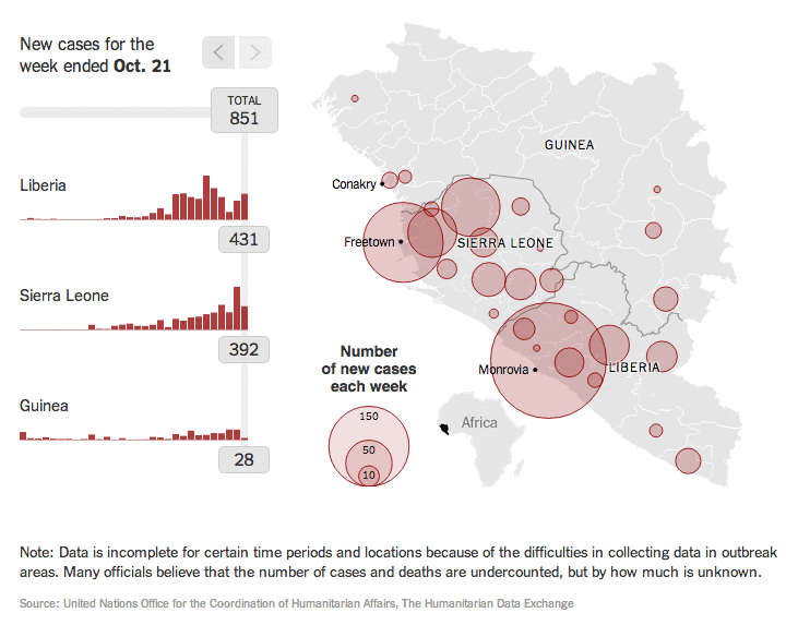
Infographic 4.
When each of the three categories was applied to each graph, Welhausen found and advised to technical communicators that:
-
Color matters
-All of the NYT infographics use elements of color to articulate facts about Ebola. Specifically, in all of the infographics, the color red is used to articulate the number of deaths as a result of the disease. As the color red typically stands for activity, emotion, and sharpness, this use of color for the particular topic raises alarm - especially in Western culture as red is often associated with warnings about danger. This tactic can be particularly effective when a color scale moves from cool to darker colors because as the darker color among the light adds emphasis on the "sick" areas, like what is illustrated in Infographic 1. Comparatively, when cooler colors are present in the infographic, these colors can lower risk perception as they ultimately convey a message of peace and calmness, reducing the sense of urgency and fear articulated from the warmer colors. Thus color, particularly warmer colors, are important in expressing concern and risk on a global scale. But there also needs to be a healthy mix of cool colors to accurately articulate the amount of risk the public is susceptible to. -
Infographics are usually high-context forms of visual communication
-An effective infographic has very little text. More often than not, the only text available is the title or words on a scale/x- and y-axis. Often the context is meant to be extrapolated from the article the NYT infographics were associated with, but even then, a large portion of information was left up to interpretation. In many of the graphics, it is difficult to understand the severity of the epidemic as context, such as the total population of each country Ebola had affected, is left out. In many situations, such as Infographic 3, the charts appear as though Ebola is a steadily growing epidemic with no signs of reduction or containment. With a lack of context, visual communication in the form of infographics can elicit more fear of risk than is actually necessary. Thus, it is important that technical communicators work to translate these high-context visuals into low-context visuals; which can be done through the evaluation of numeric data expressed in the chart within the context of other information (such as providing explanatory information within the graph or in caption form). -
Articulate infographics in terms of the group, not the individual
-A collectivist view used to articulate the risk of the public's health, although geared toward the individual, is ultimately about the safety of the public; therefore, the best practice for technical communicators is to phrase their data as such. All of the infographics from the NYT articulate this viewpoint as they use all relate to the specific group of countries in West Africa that are being affected and analyzes them in quantitative values. Although the infographic uses a geographic location, it is not using a broad depiction of Africa to make it appear as though Ebola is spreading around the world uncontrollably. There is an art to depicting a group identity, it should not be too large that the virus seems to be everywhere, nor should it be too small and concentrated that it appears individualistic. Analyzing the epidemic in terms of the group is not only beneficial in articulating the message of risk, but it is effective in developing solutions to the problem at hand. As Welhausen states, "This is because when working in this area, researchers need to make effective decisions involving the well being of groups of persons versus focusing on the individual needs and expectations of all members of that group" (p. 252). Furthermore, displaying information in an individualistic manner decreases the perceived amount of risk from a situation, which can be detrimental when a situation is, in fact, dire.
Overall, these infographics embody the three elements of color, context, and group/individual thinking. Albeit, these infographics may not utilize these aspects perfectly to accurately display how much risk nonexperts may be in. However, using Welhausen's ideas, the visual communication of serious issues, such as epidemic diseases like Ebola, can effectively inform the public's perception of risk and accurately convey data.
The use of infographics in order to communicate information is an extremely relevant topic of conversation for my professional life. As a Digital Communications Consultant, I'm often teaching students how infographics are a useful tool in communicating important, yet dense, information. Although I teach the basics of infographic design - such as how the graphics on the infographic need to articulate relevant information, not just be used as colorful decoration - a few of the points brought up in this piece were new information to me. Using the three categories Welhausen mentions to analyze the four NYT infographics, I found that her first bullet and the last bullet were particularly useful in infographic design.
The first category, using color in effective ways, was very interesting. I thought the universal reactions to certain colors was important insight, as several infographics are used in global news reports. However, whenever I am advising students on how to create their color schemes for infographics, the most important information I often articulate to them is that there needs to be a consistent use of color schemes (usually three colors [at most] used in their graphic). I had never considered the impact certain colors they pick for their brand would articulate hidden messages and feelings among viewers. But after reading this piece, it seems logical. Red is often used to elicit feelings of power or urgency, for example, politicians will often wear red as a power statement piece to illustrate their credibility to lead. Therefore, Welhausen's point that warm colors such as red are seen as "emotional" and "active" only seems reasonable. In terms of risk assessment, this sense also applies; red is bad, and green/blue is often associated in my mind as good. The more red I see on a graphic, the more alert and afraid I will usually be of the problem. Therefore, I completely agree with Welhausen's advice, there must be an active balance between the color schemes used - too much red, and you've left people paralyzed with fear; while too little red and more cool colors make the situation seem less intense, which is often not the case. How much risk should be felt from the public is ultimately left to the infographic creator, but this power should be understood and effectively used to engender change or awareness.
The second category, more or less context illustrated from an infographic, was actually an idea I was familiar with. As I stated before, your infographic needs to hold designs or content that is informative and purposeful. Therefore, you need to provide context and understanding to the viewer. Because more often than not, the individual reading your infographic is not an expert on the information you are presenting. An example I frequently give to my students is this:
Figure 1, on the left, explains information about the state of mobile marketing, however, there are an astronomical amount of text on the graphic and the graphics used do not provide further information about the topic at hand. This is illustrated when you take away the text in Figure 2. There needs to be a healthy mix of information about the content and an effective use of graphics. In order to properly provide context, there needs to be information and disclaimers about the content created. For example, in the above infographic, there needs to be disclaimers about the sample size these percentages came from. After showing these examples, I always follow with an improved example of these infographics, that looks like Figure 3.
Instead, all of the information presented is clearly articulated in terms of
photos, percentages, and interesting or catchy titles. Although it is clearer what the
information is saying, there is still little context presented to help the reader
understand where this information came from. Thus, context is an important
feature in helping the audience understand your work and it adds credibility to
your work. A point I understood and appreciated Welhausen making in her work.
Another interesting point Welhausen spoke about in her work was how countries
like the United States and Germany typically create low-context infographics, so
all of the information is presented clearly and explicitly in their graphics. At first,
I thought this fact was slightly insulting - does this mean most Americans are not
smart enough to understand this information without proper context? Do most
people not read or watch the news enough to understand? But creating low-context
infographics is actually a better creation style of infographics as it leads to
more informed viewers and accurately explains the level of risk a population is at.
The final category of analysis, explaining infographics in terms of a group or an
individual, is a point I had never taken into consideration. Honestly, I had always
thought of infographics as addressing a group audience, there does not seem to be
a point in creating an entire infographic for an individual - unless the infographic is
used to explain what a particular illness will do to an individual if they get sick.
However, I'm not even sure Welhausen would agree with that point as she is very
adamant that, "This collectivistic perspective is fundamental for managing outbreaks,"
(p. 252). Which makes sense because, if one was to create a graphic about
the potential effects an illness would have on a patient, it could cause more fear
than informative impact. The individual could think all of these possible ailments
could affect them, instead of just being a graphic that explains potential symptoms.
Overall, I found Welhausen's piece to be incredibly informative and useful in explaining how to properly articulate information, especially when they involve aspects of risk management. As an incredibly important and frequently needed source of media, I think this article was powerful in how graphics can impact a global level of fear. I know I will personally use this information when working with nursing students to create infographics about different illnesses.
References
Welhausen, C. A. (2015). "Visualizing a Non-Pandemic:Considerations for Communicating PublicHealth Risks in Intercultural Contexts." Journal of the Society for Technical Communication, 62(4), 244-257.


Figure 1.
Figure 2.
Figure 3.